
When building an application for users running an SAP solution, programming design principles dictate that you must keep the user in mind.
For example, try to look at your application through the eyes of someone who is looking at the screen for the first time. In this blog, we’ll describe some principles that will help you build user-centric applications.
Some of these ideas may seem intuitive; however, you might be surprised how often basic, intuitive programming design principles are violated during the design process. We’ll end the blog by looking at International Business Communication Standards (IBCS) as they relate to design.
1 Don’t Make Users Think
An application should be as obvious and self-explanatory as possible. Your job as a developer is to limit the number of question marks for the user and to make the application navigation as intuitive as possible. If this goal isn’t accomplished, users won’t understand how to use the application to find the information they are looking for. Eventually, they will stop looking.
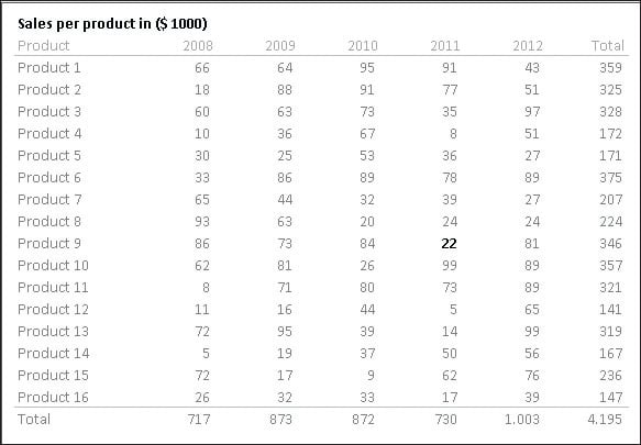
For example, if a manager asks for a report so he can see how every region performed the day before, you can show him all kinds of comparisons. In the first example shown in the first figure, you’ll see a table with comparisons to the budget in the month, cumulative year values, last year values, and so on.
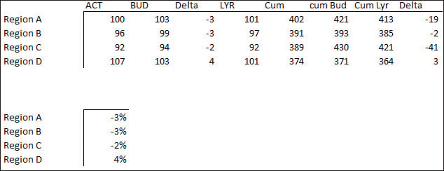
In the second example, shown in the same figure above, you’ll see only a percentage. The second example is much easier to grasp because it doesn’t require much thinking. Now imagine that this report was about 50 stores instead of just 4 regions—this difference has the potential to significantly impact user comprehension.
2 Don’t Make Users Wait
When you build an application, always keep performance in mind. How long do users have to wait at the start? How long does it take for them to go to page 3 of the pagebook component?
When an application contains many data sources, think of a scenario where some basic information is already visible at startup, and the rest will be loaded when needed. Then, the user will have some instant gratification because he will immediately see some results.
Research has found that, if a website takes longer than 7 seconds to show anything, half the users give up. After another 7 seconds, the remaining half gives up too.
3 Manage User Focus
The human eye immediately recognizes edges, patterns, and motions. Think of how often you’ve reacted to a movement you saw out of the corner of your eye. Use those elements for the most important information, and avoid using them for the rest.
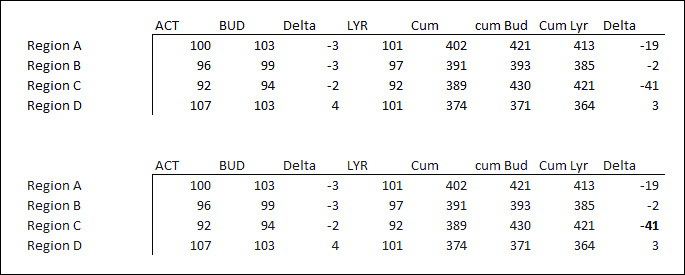
In this example, we again show the table with the sales of four regions. In the bottom table, we highlighted one number that we think is the most important. Note that finding this number on the top table is much more difficult.
4 Emphasize Features
Another key programming design principle is to clearly emphasize the important features in your application. Design a clear structure and create buttons that are obvious for the user. At first glance, the user should immediately know where he can click and what he can expect after clicking. Letting the user know what is available is one of the fundamental principles of design.
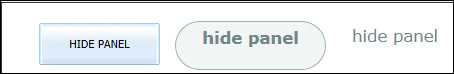
In the example shown in the following figure, three buttons with the same function are displayed. The left one is the most obvious. The right one, on the other hand, would make the user pause because it doesn’t even look like a button.
5 Keep It Simple
Users go to an application to get information or to perform a particular task. Although they might be amused at first by a fancy design, in the end, they just want to get their information or perform their task as easily as possible.
As shown in the figure below, the second example was much easier to grasp. One of the reasons for this difference is that the second table is much simpler and is dedicated to the question, “How did we do?” Sometimes, more isn’t always better.
Experience shows that keeping applications simple is hard to do. People will always ask for more features, and if you keep adding them, at some point, your application will need an overly long users’ manual. Be mindful of this consideration from the beginning and try to say “no” more often to keep the application focused.
6 Use Conventions
Although thinking of new ways to show information can be fun, often the basic conventions are the best choice. Users are accustomed to these conventions and therefore won’t need as much time to get started with a new application. Only deviate from conventions when you have a clear reason to believe that the new option will be an improvement over convention.
A group of commonly used conventions are the International Business Communication Standards (IBCS). The IBCS are proposals for the conceptual, perceptual, and semantic design of comprehensible business reports and presentations. We’ll discuss this convention in more depth near the end of this blog.
As shown in the previous figure, the left button is the easiest to recognize. This button is easier to grasp than the second one because we’re used to this kind of button. Over the years, we’ve clicked thousands of buttons like this one. Now, when we see a visualization like that, we immediately assume it’s a button, without even looking at the text on it.
7 Get the Most Out of Screen Room
The most challenging aspect of application design in this mobile age is that you need to put a lot of information, often in rather different themes, into a small amount of real estate: the computer screen, tablet screen, or even a mobile phone screen. Inserting all this information must not jeopardize the clarity of the application.
The following principles apply:
- Summarize the information and show the exceptions.
- Try to avoid elements that don’t present data.
- If you can’t avoid nondata elements, try to make them blend in as much as possible.
- Highlight the most important information because this information needs to be seen first.
- Keep the most important part of the screen for the most important information. The top left and middle are the most important parts.
To help you do more with less, let’s briefly discuss the data-to-pixel ratio. The data-to-pixel ratio is derived from the data-ink ratio, which was introduced by Edward R. Tufte. When information is displayed on the screen, some of the pixels show the data, and the other pixels show visual elements that don’t represent data.
To build a lean dashboard that uses the screen well and avoids overloading the user with too many elements, you should try to maximize the ratio. This ratio creates room to put more information in the same amount of space without overwhelming the user with all kinds of signals.
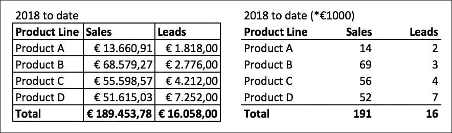
In the example shown in the next figure, two tables show the exact same information. However, notice how the second table provides a lot less distraction and allows you to focus on the numbers.
Another advantage of reducing the number of elements is that you don’t have to shout if you want to highlight a particular number. Just emphasizing the number slightly can be enough, as shown in the figure below.
8 Utilize International Business Communication Standards
If you’re looking for a good way to visualize data and convey messages to users, we recommend considering the IBCS. IBCS includes proposals for the design of comprehensible business reports and presentations.
IBCS is a wide methodology that covers topics such as data visualization, key performance indicator (KPI) selection, message delivery, structuring reports, and many more. In this section, we’ll provide a high-level overview of the methodology.
The IBCS is set up in three rule groups that are the pillars of IBCS:
- Conceptual rules: Conceptual rules get the message across by using the appropriate storyline. These rules look at the conveyance of the message (say) and organization of the content (structure).
- Perceptual rules: Perceptual rules determine the appropriate visual design. They correspond with the rule sets for the following: (1) Express: Choose the right visualization to convey the message and the underlying facts. (2) Simplify: Avoid clutter. (3) Condense: Increase information density. (4) Check: Present information in the most truthful and most easily understood way possible.
- Semantic rules: Semantic rules relay content clearly by using a uniform notation (IBCS notation).
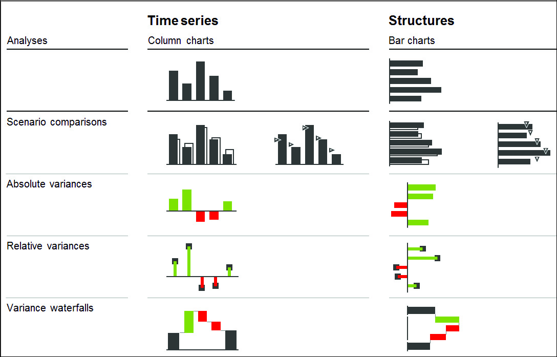
The final figure shows a small part of the express rule set, which is a list of charts organized by use based on the type of analysis. For example, notice that a column chart is reserved for time series and that bar charts are used for structural data such as regions, countries, products, and so on.
Conclusion
When it comes to creating an SAP app, keeping the user in mind is important. By following the eight programming design principles outlined above, you’ll be able to keep users in the front of your mind and create apps that both look and function beautifully.
Editor’s note: This post has been adapted from a section of the book SAP Lumira, Designer Edition: The Comprehensive Guide by Dwain Chang, Xavier Hacking, and Jeroen van der A.


Comments