
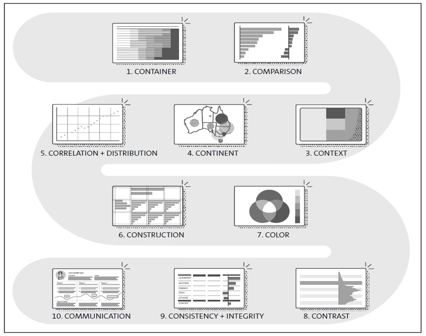
When it comes to dashboard design, there are ten rules, set up in two parts, according to the design principle of “form follows function.”
The first five rules ensure that appropriate visualization types are chosen. The next five rules ensure that the form of the dashboard is optimized to give confidence for decision-making. Below lays out the complete list of the rules.
- Use containers that are best suited to showing and reading your type of data.
- Compare data using charts appropriate for the type of comparison. Use truthful scale factors.
- Show data and its relation as part of a whole.
- Bind the data to where it makes sense geographically.
- Use charts that plot the relationship between measures, and the distribution of values within a measure.
- Build using a grid to align and scale elements consistently.
- Understand color theory to use color appropriately.
- Contrast a single neutral color for graphic elements with visible colors that have known semantic meaning for data highlights and alerts.
- Keep the dashboard design uniform and coherent with corporate style and visual standards.
- Ensure everything in the dashboard is relevant and revealing so the user understands the data and is empowered to make a confident decision.
Let’s now jump into the rules:
Containers
The simplest form to store and read data is a table, a container storing the data of two or more related data sets in columns and rows. The information is encoded as text, including numbers and words.
Data sets can be dimensions or measures. Usually, tables contain measures, but sometimes they show dimensions only, such as the type of service level agreement for a list of customers. With measures, tables usually display detail values, but also summary values, such as a total. Tables make it easy to look up and read individual values precisely. Numeric points can be seen as the smallest possible tables, containing just one cell. A heatmap highlights the biggest values and makes it easier to recognize patterns in large tables.
Some examples of where this applies are incidents per age group over time, and a list of customers to be called most urgently.
Comparison
Comparing measures of magnitude is the most common purpose for dashboard consumption. While tables only support the comparison of two measure values, bar charts are made for comparing multiple values at a glance, especially when ordered by rank, vertically arranged to show changes over time and horizontally arranged for other categories. Watch out for a truthful scale to prevent Tufte’s lie factor. A variance chart on top allows you to display yet another comparison, such as last year or plan data (see also IBCS; https://www.ibcs.com). A line or area chart is often used to compare values over time.
Some examples of where this applies are sales per region or stock price over time.
Context
A number only has meaning in a given context. A tree map presents the number in relation to other values as part of a whole. A stacked bar chart works like a mini tree map. Pie charts are difficult to compare and eat up lots of real estate on your screen. Waterfall charts reveal increases or decreases between periods or categories. Gantt charts show the distribution of work per period.
An example of where this applies is a budget breakdown.
Continent
Data is often bound to a certain place, such as the five continents on earth. A geographical bubble chart highlights the aggregated summary of values related to a certain area in proportion to other areas on the map. Watch out for misleading screen space real estate (lie factor), for example, when showing election results from huge areas with little population in a geo choropleth map.
Some examples of where this applies are population density and cycling injuries in traffic.
Correlation/Distribution
Other often-needed chart types can be summarized under correlation and distribution. Correlation is the mutual relationship between two or more measures. The scatter plot serves to display this relationship, supporting the analysis of values from two measures. Bubble charts allow you to visualize correlations between three measures.
Charts that are well suited for analyzing the distribution of a set of measures are the box plot and the histogram. The box plot shows how data in a sample distributes around the median, using indicators such as lower quartile and upper quartile that form the box, the highest and lowest value that form the whiskers, and sometimes also outliers. The histogram is a bar chart that clusters numerical values into bins and displays their frequency.
Some examples of where this applies are outside temperature and ice cream consumption, analysis of the distribution of usage tracking data, or number of plane arrivals per hour of the day.
Construction
A design grid is a series of intersecting vertical and horizontal lines to build a framework to align graphic elements on a page in an easy-to-grasp manner. Newspapers are composed of such a grid.
An example of where this applies are small multiples and a series of charts using the same scale and axis arranged in a grid to support gestalt laws such as continuation, similarity and proximity.
Color
The visible light spectrum for the human eye spans from ~700 nm (red) to ~400 nm (violet). Adding up all primary light colors of red, green, and blue leads to white; the absence of light is black. Similarly, complementary colors (red-cyan, green-magenta, blue-yellow) are most contrasting and cancel each other out.
Some examples of where this applies are shades (mixing a color with black) or tints (mixing a color with white), which can be used to define a palette of distinguishable tones of the same color when working with heatmaps or choropleth maps.
Contrast
Keep the design simple and neutral. When applying the preceding rules, your dashboard already inherits differentiating readability features such as small and big bars or dark and light color tones.
Because every dashboard is made for decision support, it should be designed as simple and neutral as possible. You may achieve this by omitting unnecessary elements and redundancy to optimize Tufte’s data-ink ratio and picking an unobtrusive color that is either grayscale or in-brand for main graphic elements such as type and charts. Additionally, alerts or highlighted comments should be visible at first glance.
Some examples of where this applies are deemphasized user interface (UI) controls. Expose negative/positive variances in red/green and highlight key messages via comments in a contrasting color with no semantic association.
Consistency/Integrity
A uniform style enhances the readability and reduces the time to understand and act on the messages and patterns detected. Fonts, colors, and imagery should adhere to a corporate style guide. Check also for integrity: Do your charts have truthful titles, legends, scales, and unit of measures? Did you watch out for logical flaws? Apply the Minto MECE Principle to separate mutually exclusive and collectively exhaustive (MECE) information.
Some examples of where this applies are when showing sales data for France, Denmark, and Germany (40, 20, 30), adding up to a total of 100, but forgetting about the “others” category (10 accumulated in smaller countries).
Communication
Think of the experience you foresee for the dashboard users, such as giving a talk aiming to convince the audience, participating in a vivid debate aiming to make the best decision possible, or exploring an unknown data set to reveal a story. Ask yourself why they care about the numbers and what led to the peaks and insights buried within. A dashboard can be a communication assistant, common knowledge board to make decisions on, or an information management system fostering curiosity and creativity for people working with data.
Some examples of where this applies are consistent and easy-to-operate action placement for input controls such as filters. Use the peak-end rule: design first and foremost for the most exciting and final moments of your user’s journey.
The figure below summarizes all ten of the golden rules.
Want to create a dashboard of your own? A solution like SAP Analytics Cloud can help you do just that. Learn more about becoming a dashboard designing with SAP Analytics Cloud here.
If you find the process challenging, consider hiring a dashboard developer to ensure fully functional and customized dashboards
Editor’s note: This post has been adapted from a section of the book Designing Dashboards with SAP Analytics Cloud by Erik Bertram, James Charlton, Nina Hollender, Melanie Holzapfel, Nico Licht, and Carmen Paduraru.

Comments