
SAP Fiori elements offers you a range of floorplans. Whether you want to create an overview page with key figures or simply display a large amount of data in list form, there is a floorplan for every common use case.
In addition to a list display, you can also create a detailed view for the individual objects within this list, which you can jump to when you select an object. You can use this detailed view to create new objects or edit existing ones. And statistical data can also be displayed in various ways with a floorplan.
We briefly introduce the available floorplans and their functions in the following sections. We’ll then show a detailed development example for each floorplan type.
OData Version: The individual floorplans sometimes differ depending on which OData version you’re using. Versions 2 and 4 are available, so it could be that certain functions or annotations are only available in one of the two versions or work differently in the two versions. In the following examples we use OData V2.
Overview Page
If you want to display an overview or dashboard for a specific business area or topic, it’s best to use the floorplan overview page for this purpose. The overview page is particularly suitable for displaying the following information:
- Key tasks to be completed
- Various notes on a task area
- Various key performance indicators (KPIs)
In addition, you can also display diagrams and graphics on an overview page. The data displayed on the overview page is usually compiled from a variety of sources and is intended to provide the user with an overall view. For example, you could show data on all your products, customers, suppliers, or similar on an overview page.
The figure below shows what an overview page might look like. Cards are used to display the data. Cards are design elements on which the most important information about an object can be clearly displayed. Similar to tiles, cards allow a UI that brings together information on several objects or from several apps to be structured dynamically and clearly. This floorplan is also characterized by this design element. What kind of content you place on the individual cards is up to you. You can display tables, lists, diagrams, or tiles of any kind within the individual cards.
Basically, an overview page consists of two areas:
- Dynamic page header
- Dynamic page content
In the upper area of the app is the dynamic page header (1), which contains general information about the app. Here, for instance, the title describes the area for which the app provides data, such as purchasing or maintenance. You’ll also find some user-specific settings in the header area. For example, you can call up and manage your user profile here. It’s also possible to manage the displayed cards here.
If you want to further restrict the data displayed, you can do so using smart filter (2), which is located below the title in the dynamic page header. For example, you can filter the data displayed so that only entries that match your filter criteria are shown, such as only certain date values, totals, and so on.
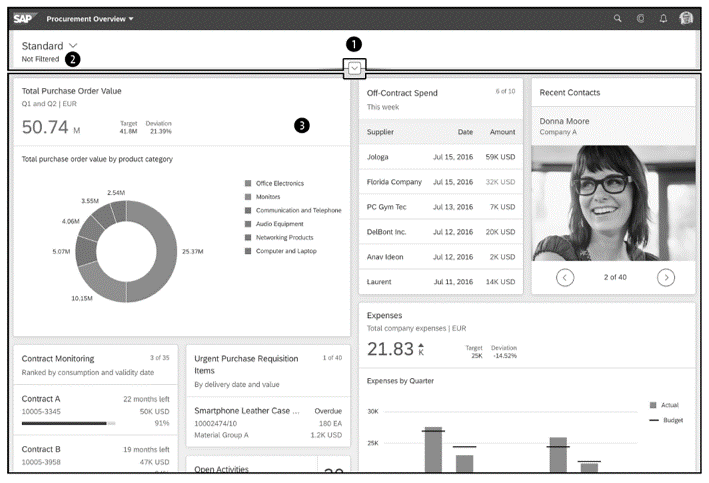
The actual content is represented by the area with the cards, also called dynamic page content (3). Cards belong to the components of the UI that can be configured via annotations. This makes them very versatile, as data can be displayed in many different ways. All kinds of charts, tables, or lists can be displayed within a card. The cards are displayed in five dynamic columns, whereby a card can also extend over several columns. They can be arranged as desired via drag and drop.
Note that a card is always bound to exactly one entity set. For example, if you want to display a product list on a card, this can be defined in a JavaScript Object Notation (JSON) object, as shown in the listing below. This object can be found in the manifest.json file of your SAP Fiori elements app. When adding a card via one of the development environments, the corresponding definition is added at the code level.
"sap.ovp": {
"cards": {
"card01": {
"model": "ZCP_PRODUCTS_SRV",
"template": "sap.ovp.cards.list",
"settings": {
"sortBy": "Price",
"sortOrder": "descending",
"listFlavor": "bar",
"annotationPath": "com.sap.vocabularies.UI.v1.LineItem#bar",
"category": "",
"entitySet": "ProductSet"
}
}
}
}
Floorplans for Lists
With the list floorplans, you have the option of displaying data in list or table form. Unlike the overview page, three variants of the list floorplan are available here, which are used depending on the app:
- List report
- Analytical list page
- Worklist
All three floorplans are ideal for presenting data in the form of lists or tables. However, there are some differences in their use, which we’ll now discuss briefly.
List Report
The list report is mainly used when large amounts of data need to be displayed and the individual entries need to be handled. The presentation doesn’t necessarily have to be in tabular or list form, and a diagram is also possible. In addition, this floorplan enables users to prepare the result set accordingly by means of filters, sorting, and grouping. In this way, large amounts of data can be reduced to the relevant records.
However, you should not use the list report if you want to see the details of a record. In this case, the object page would be suitable.
The list report is structured as follows:
- Dynamic page header
- Content area
- Footer toolbar
At the top of the page, you’ll find the dynamic page header mentioned earlier (callout 1 in the figure below). This header contains the title of the report and tells you what information is displayed with the app. In addition, you’ll also find the filter line and buttons for general actions in the dynamic page header. These actions allow you to expand or compress the header. You can also pin or unpin it so that it’s always displayed or only at the top when scrolling through the list.
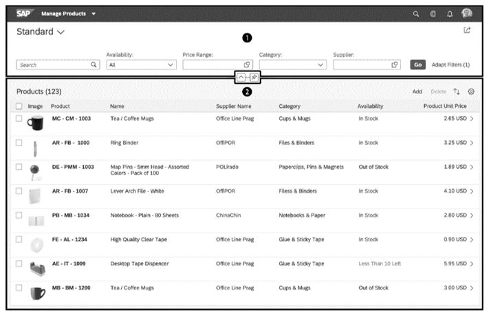
The content area (2) displays the actual content in table, list, or chart form. You can display data in different ways in this area. In addition, a title and an icon tab bar are displayed above the list. The latter can contain text buttons and/or icons.
In the footer toolbar, you’ll find overarching actions that relate to the entire data overview, for example, saving or starting a simulation, as well as a notification icon, if applicable. This icon allows you to view notifications of errors that have occurred in a floating menu (popover). The footer toolbar is optional.
The previous figure shows what a list report might look like. In this example, however, no footer toolbar is used—only the dynamic page header with the filter functions and the content area.
Worklist
The worklist is very similar to the list report in some respects. This floorplan is also used when large amounts of data need to be presented in list or table form. However, the data processed in a worklist differs from that of a list report. A list report displays all data. A worklist displays data on tasks that need to be completed by the user. A worklist can be used in an approval/rejection process, for example. As a rule, users can choose whether to complete a work item themselves or to delegate it.
The structure of the worklist basically corresponds to that of the list report. You’ll find the following sections here as well:
- Header title
- Content area
- Footer toolbar
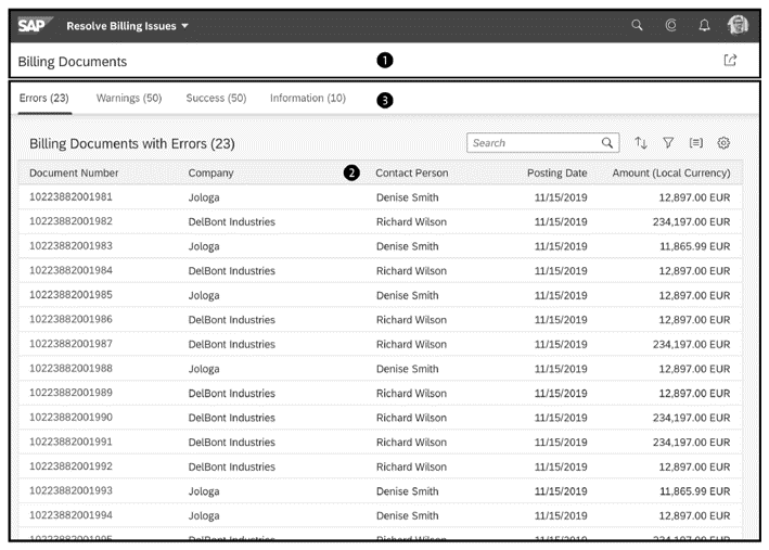
The figure below shows an example of a worklist. The header title and header tool are visible in the upper area, and the content area with several tabs is directly below. The header title (1) for the worklist is the counterpart to the dynamic page header of the list report. However, KPIs can also be displayed here. In the content area (2), you’ll find the table with the work items. In addition, a tab bar (3) can be inserted to filter the displayed data via different tabs. The footer toolbar is used in the same way as the list report. Here, too, closing functions and a floating menu (popover) for notifications are available.
Analytical List Page
The third list floorplan is the analytical list page, which offers you the possibility to display a wide variety of data in a unique way. For example, you can break down data into individual items and analyze them in different ways. To do this, you don’t have to navigate back and forth, but can stay on the same page. In addition to a simple table view, the analytical list page allows you to display selected data in charts and more detailed lists. This allows users to see all the data sets that are relevant to them at first glance.
Highest and lowest values in particular, as well as deviations, can be displayed especially well.
Unlike the other two list floorplans, the analytical list page consists of only two elements:
- Analytical list page header
- Analytical list page content area
The analytical list page header (callout 1 in the figure below) contains filter operations in addition to a title. You’ll also find the option to expand or compress the filter bar here. You can display data in a formatted form within the header using KPIs. The analytical list page content area (2) contains the content of the analytical list page. This can be displayed using a wide variety of UI elements. It’s up to you whether you display the data using a table, diagram, or both.
The analytical list page is particularly useful when the app needs to provide key information about a subject or topic area at a glance. It’s often used to gain insight into the current situation and to understand how this data came about. To do this, it’s often necessary to break down data to several levels, for which the analytical list page is very well suited. If, on the other hand, it’s only a question of displaying an arbitrary list of data or the detailed view of an object, this floorplan should not be used.
Below shows the hybrid view of an analytical list page.
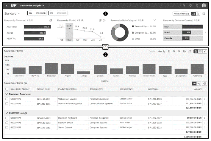
In addition to a tabular representation, this also contains diagrams. The tables and the charts are based on the same data. However, in the table view the data is broken down in more detail. While in the diagram, you see the Sales Orders cumulated per customer, the tables show the individual orders of each Customer. This view provides an improved overview of this data.
Object Page
In the previous sections, we’ve looked at floorplans that allow data to be displayed in tables or charts. What we’re still missing is the detailed view of a business object. This is made possible by the object page. However, the functions of the object page go beyond those of a detailed view. You can also use it to create new objects, edit existing ones, or delete them. Depending on how complex your objects are, you can display the data in simple forms or in tables.
The object page is made up of the following components:
- Dynamic page header
- Navigation bar (optional)
- Content area
- Footer toolbar (optional)
The dynamic page header (callout 1 in the next figure) contains key information about the displayed object. You’ll also find an Edit button and a Delete button here. In addition to the title, the header also contains a subtitle or breadcrumbs.
You can use the navigation bar (2) to control which content is displayed in the content area. This can be used in two different ways:
Anchor bar: An anchor bar consists of a series of links that refer to different subsections. Clicking on such a link takes you to the corresponding subsection. The anchor bar is mainly used when the contents of the individual sections belong together.
Tab bar: The tab bar also contains links. However, these refer to other pages within the app. This form of navigation is used when different contents are displayed on the individual pages.
The available tabs are displayed in the form of horizontally arranged links. Each of these links can be used to jump to a section or subsection.
The content area displays the detailed data of an object. this representation is done by means of sections (3) and subsections (4). A section can be seen as a kind of container that contains several subsections. Each section has a title. In the subsections, you’ll find the actual contents. Each subsection also has a title and a toolbar. Whether you display tables, forms, or diagrams in the subsections is up to you.
Below the content area is the footer toolbar, which contains, if available, final actions such as saving, canceling, or accepting changes.
Below shows what an object page might look like. In the header, some important KPIs are shown here. You’ll also find actions such as editing or deleting an object, but also more specific functions. In the content area, the details of the selected object are displayed in forms and tables.
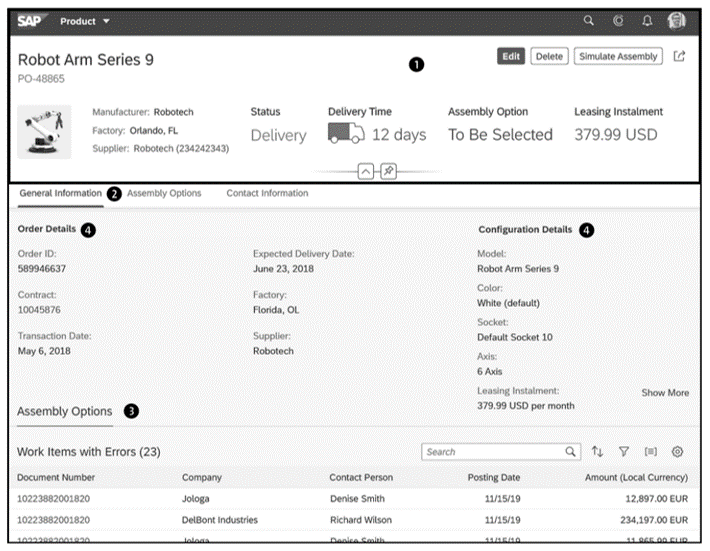
The object page should be used if you want to allow users to view, create, and edit business objects. It’s also very practical to get an overview of an object and to use some interaction possibilities.
Editor’s note: This post has been adapted from a section of the book SAP Fiori Elements: Development and Extensibility by Rene Glavanovits, Martin Koch, Daniel Krancz, and Maximilian Olzinger. Rene is an SAP consultant and developer who specializes in the latest SAP technologies, specifically in the development of full-stack applications with SAP Fiori, SAPUI5, OData, CDS, and SAP Cloud Application Programming Model. Martin conducts training for SAP and has developed four training courses on the topics of SAPUI5, SAP Fiori, cloud integration, and cloud security. Daniel is a software developer and consultant who focuses on full-stack development with SAPUI5, SAP Fiori, OData, SAP Cloud Application Programming Model, as well as mobile development. Maximilian is a software developer and consultant. He is an SAP Certified Development Associate and has handled projects for companies in all industries with great success. He conducts trainings in the areas of SAP Fiori, ABAP and web development.
This post was originally published 8/2023.
.png?height=600&name=Introduction%20to%20OData%20in%20SAP%20(2).png)

Comments