
In this blog post, we’ll explain how to create an SAP Analytics Cloud story with SAP S/4HANA Cloud data and how to build each area of a dashboard.
Create a Story
To create an SAP Analytics Cloud story, follow these steps:
- As a key user, from the SAP Fiori launchpad, go to KPI Design, and choose the Manage KPIs and Reports tile. Choose Stories on the top left, and click Create.
In the New Story window, there are three tabs on top: Definition (to define the title, tags, and description), Configuration (to select the data source and build the dashboard), and Applications (to bind the dashboard to an application).
- On the Definition tab, enter a name for your story (e.g., “Europe Procurement Overview”), add some tags (e.g., S/4HANA, SAC, and SAP), and enter a description.
Note: Another thing you might notice right away is the Activate button. The Save button is different when you compare SAP Analytics Cloud, embedded edition with SAP Analytics Cloud. If you click the Save button in SAP Analytics Cloud, you must choose a folder and manage the content by yourself. In SAP Analytics Cloud, embedded edition, the Save button has been replaced by the Activate button, which will save the story.
- Go to the Configuration tab. There you can select the data sources you want to use and set variable values for the selected data source to fit charts and tables. In the Configuration tab, you can design your dashboard in the same way as we did with SAP Analytics Cloud in all the other chapters of this book because this tab offers the same story toolbar with the usual features, as well as the Designer on the right.
Header Area
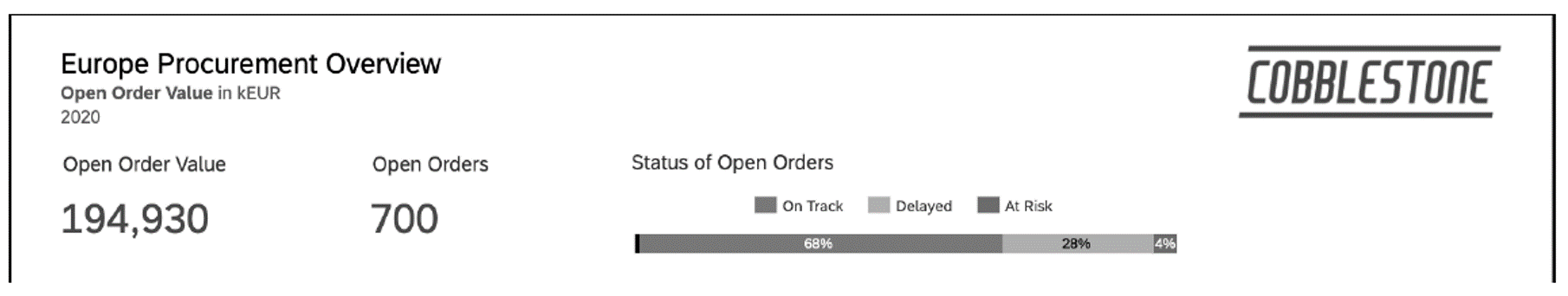
To build the header, insert the title, logo, and the first two KPIs (Open Order Value and Open Orders).
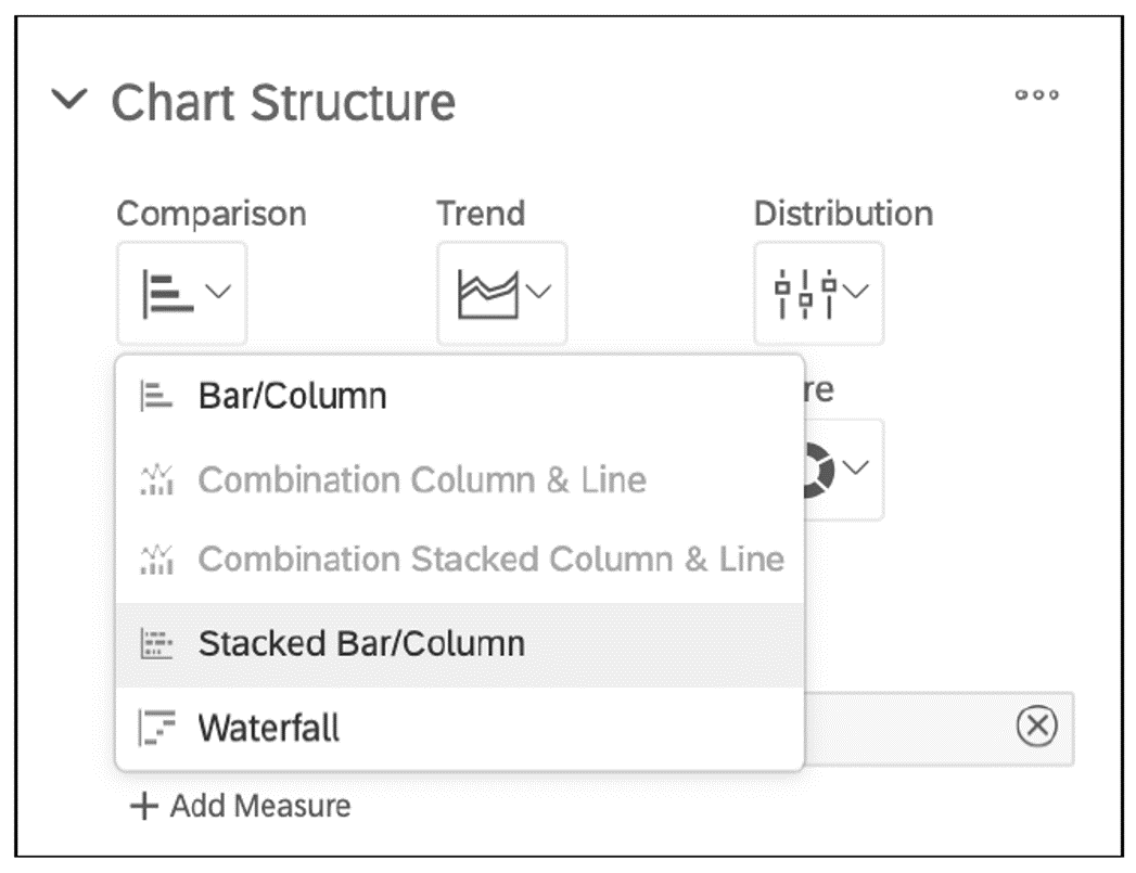
To help your business users quickly understand what’s currently happening with the open orders, you can add a stacked bar chart to the header and use colors to communicate the status. A stacked bar chart shows how the categories contribute to the whole value.
To create a stacked bar chart, in the Builder panel, go to Chart Structure, and choose Comparison > Stacked Bar/Column, as shown in this figure.
Next, select the chart orientation (in this case, Horizontal), check the Show Chart as 100% checkbox, and select your measure. In the Color area, select Add Dimension to choose Status and Create New Palette to choose the colors that will indicate three different statuses (e.g., green for a positive status, yellow for delayed orders, and orange for orders at risk). Don’t forget to enable the legend from the context menu Show/Hide > Legend. For reference, the settings of our stacked bar chart are shown in this figure.
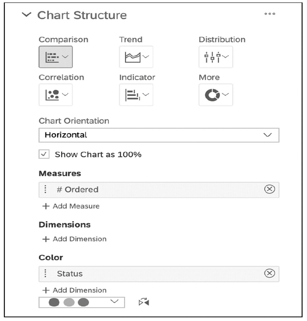
Golden Rule: Context: Try to show data and its relation as part of a whole. Stacked bar charts are used to show how a larger category is divided into smaller categories and are useful to compare total values across several categories.
The result of the header will look like this.
Second Dashboard Area
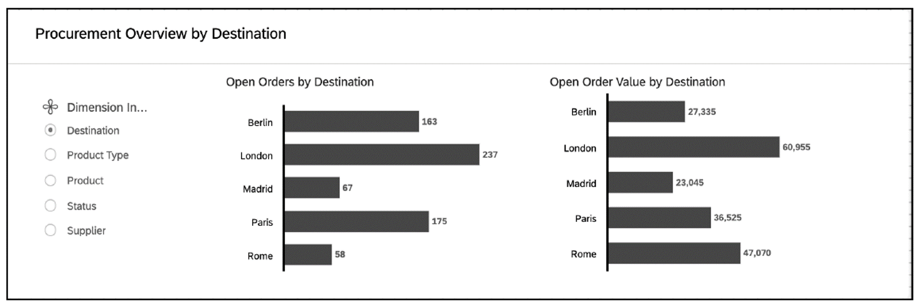
In this dashboard area, we’ll show the same KPIs in more detail and will give the business user the ability to explore the charts through a dimension filter.
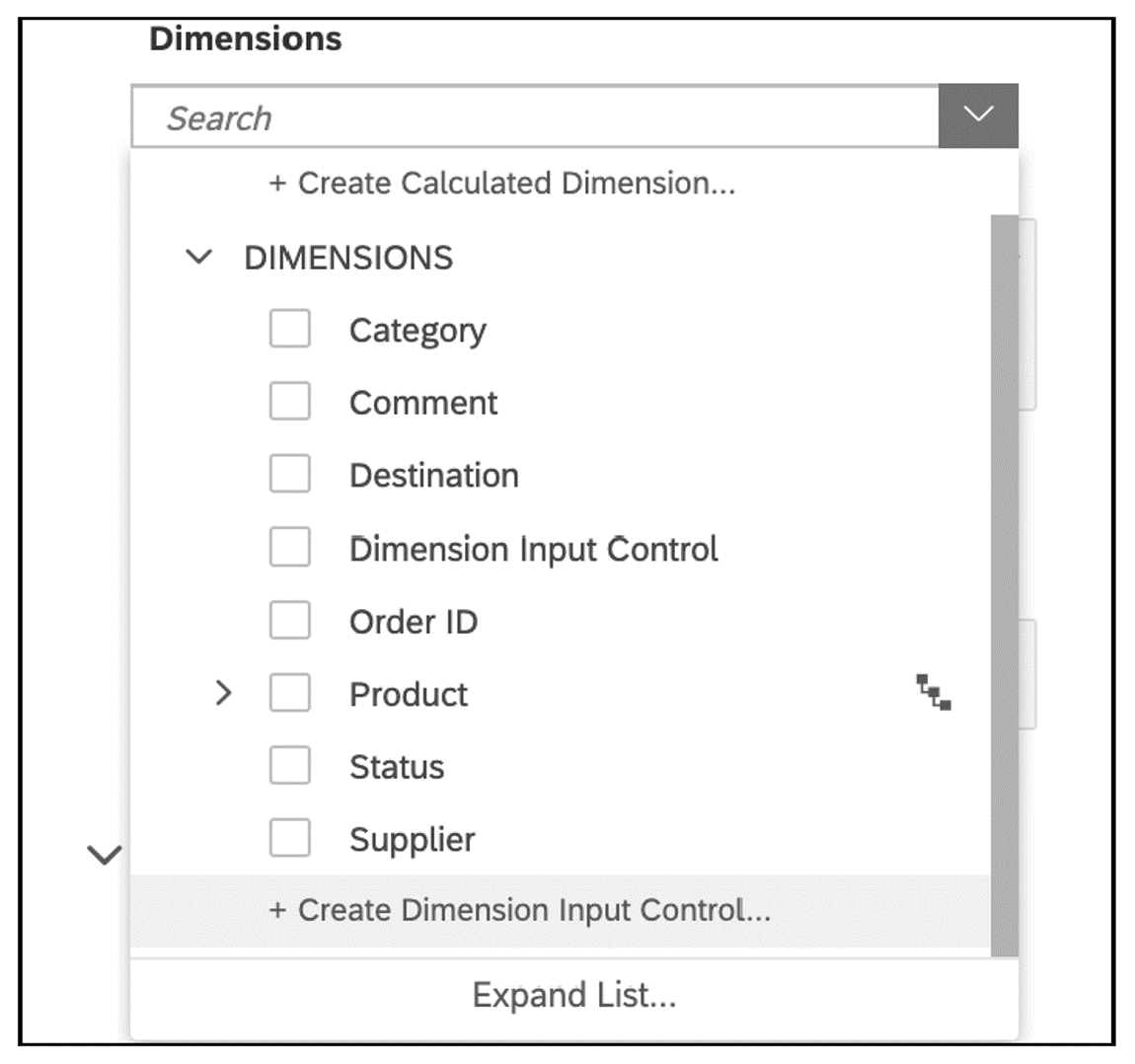
When we create a new chart in SAP Analytics Cloud, we usually select measures and dimensions to be shown on the chart. In this chapter, we’ll show you a more interactive option. We’ll use an input control and let the business user decide what dimensions to explore. To create this input control, insert a new bar chart. In the Builder panel, select the measure, and choose Create Dimension Input Control from the Dimensions area, as shown in the following figure.
8
From the New Dimension Input Control window, select all the dimensions you want your business user to have access to, as shown here.
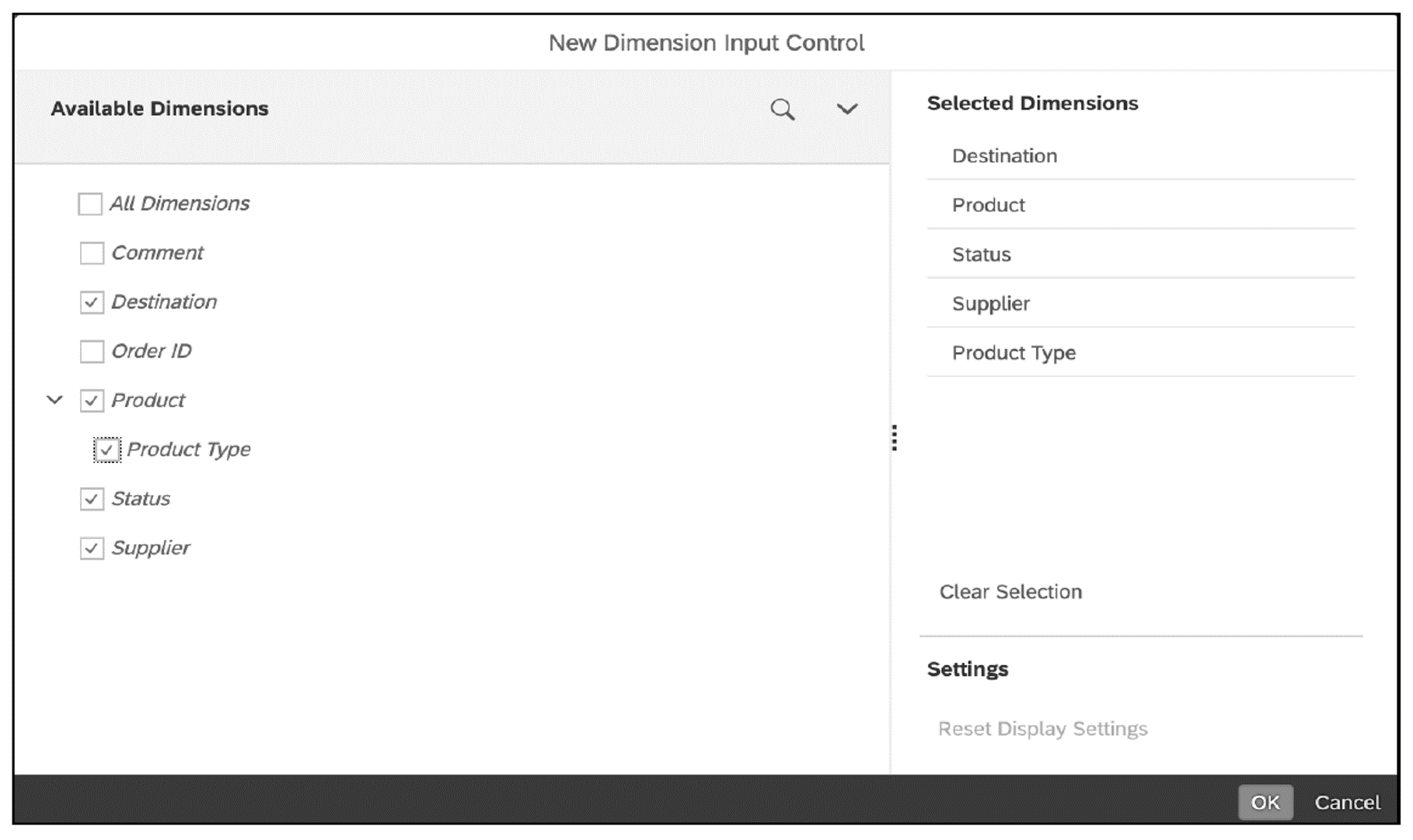
After you select OK on the bottom right, a new chart and an input control will be added to your dashboard, as shown here.
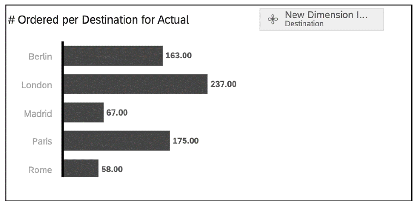
Add a second chart, and choose Order Value as the measure. This time, the dimension input control created previously will be displayed directly in the dimension list so that you can choose it from there. The second chart will be added to your dashboard. This allows you to enable the business user to filter both charts by any dimension available.
As a next step, align the three widgets in this area. Expand the input control widget, and drag it to the left. Then move both charts to the right. Placing the filter on the left will show your users that it will impact both charts on the right. The result will look like this.
Finally, style your charts. If your business users want to filter by a measure instead of a dimension, you’ll find the same option available in the Builder panel in the Measures area, which allows you to create a measure input control.
8
Third Dashboard Area
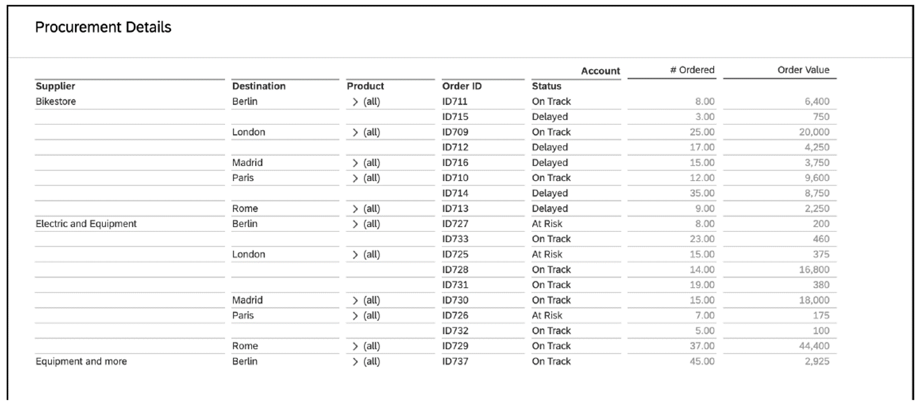
In the third dashboard area, we’ll include a table giving business users all the necessary detail information to fully understand any insights given by the charts and KPIs. Our third dashboard area looks like this one.
When you’re done, click Activate on the bottom right to save the story. This will bring you back to the Definition tab where you’ll see the description you’ve entered and the data source details.
After designing the dashboard, you’ll need to bind it to an SAP Fiori tile.
Bind the Story to an Application
To bind the story to an SAP Fiori tile, as a key user, go to the Applications tab to create an application to launch the story. From the Applications tab, you can select the tile format you want. After you choose the tile format, you can configure it.
The most interesting configuration setting is the Target Mapping area, where you can define the navigation intent. For a navigation intent, you’ll have to select a semantic object (e.g., AccountingDocument, SalesOrder) and an action (e.g., Analyze, Display, Change, Approve). The semantic object is usually a business object while the action is something that a user will do with that object, and together they are building the intent. The target mapping binds the intent with the action that results from that intent. In this way, your business users will be able to navigate between different applications, depending on the parameters and their authorizations.
After configuring the Target Mapping area, save and publish the tile to a business catalog of your choice. This will open the Custom Catalog Extension app where you can publish a tile in a desired catalog. This is how the app will find its way to the screen of the business users that have requested it. Once published, your business users will be able to access the story from a tile under KPI Design on the SAP Fiori launchpad.
As a business user, let’s check the behavior of the navigation intent. If you right click a cell in the table, you’ll see in the context menu that besides Filter, Add Calculation, and Hide Row functionalities, which are standard SAP Analytics Cloud features, there is also the Jump to option to trigger the intent-based navigation. You can see this functionality in action in this figure.
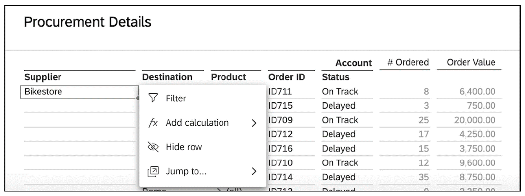
Select Jump to from the context menu, and the system offers a preconfigured list of targets that make sense to jump to from this column in the table. This is the result of the targets set in the Target Mapping area. The list will be different when choosing another column in the table. When jumping to a target, the context will be preserved as well. For example, if the bike store has an ID attached to it, you’ll notice the ID also on the newly opened application. Jumping back will take you to the same navigation state from which you initially started the navigation.
Learn SAP Analytics Cloud in Our Rheinwerk Course!
Master SAP Analytics Cloud! Learn how to connect and model data, create visualizations, work with planning models, and use predictive analytics. This five-day course provides a comprehensive introduction to the core capabilities of SAP Analytics Cloud and its all-in-one BI functionality. Get access to course recordings by clicking the banner below.

Editor’s note: This post has been adapted from a section of the book Designing Dashboards with SAP Analytics Cloud by Erik Bertram, James Charlton, Nina Hollender, Melanie Holzapfel, Nico Licht, and Carmen Paduraru.


Comments