
In SAP Analysis for Microsoft Office, not only can you link individual dimensions, you can also group multiple reports so that they look like one report.
You can navigate in the merged report as you would in a normal report. This function opens up new possibilities in data analysis.
When you group two reports together, these reports are merged in the workbook so that no empty space exists between the two reports. The row axis is the common axis of the grouped report. The crosstab from which you execute the grouping serves as the master table and determines the structure of the common report. The dependent table provides the additional axes.
Note that only the rows can form a common axis. For this reason, the crosstabs must have similar row structures so that the grouping can be carried out meaningfully. You can group several reports, but at least two reports will be required.
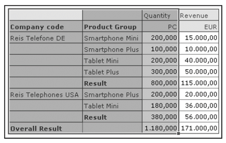
The figure below shows an example of a merged report. This report is visually indistinguishable from an ordinary report but has some limitations in its functionality.
You can add new dimensions or remove existing dimensions from the drilldown report only in the master table. Filtering dimensions is also only possible in the master table.
Furthermore, you cannot add new lines to input-ready crosstabs. Unfortunately, you cannot insert diagrams on the basis of the grouped crosstabs. If you’ve created conditional formatting rules for your dependent crosstab, this formatting won’t be displayed in the common axis. In addition, you cannot link reports across systems or using different dimensions. For example, if the first crosstab contains a particular dimension and the second crosstab contains the same InfoObject as a navigation attribute with a different technical name, no link is possible. You cannot link column axes either.
After grouping, the dependent tables adopt the settings of the master table. If you adjust the settings in the master table, they automatically apply to all dependent crosstabs. The respective navigational state is also adopted.
If, for example, you select the display option Compact Display in Rows in the master table, this formatting is also applied to the dependent crosstabs. These settings are retained even after the grouping has been removed.
Now, let’s walk through grouping and ungrouping reports.
Grouping Reports
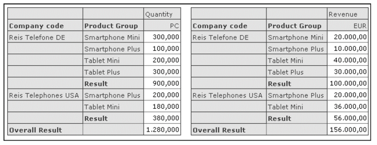
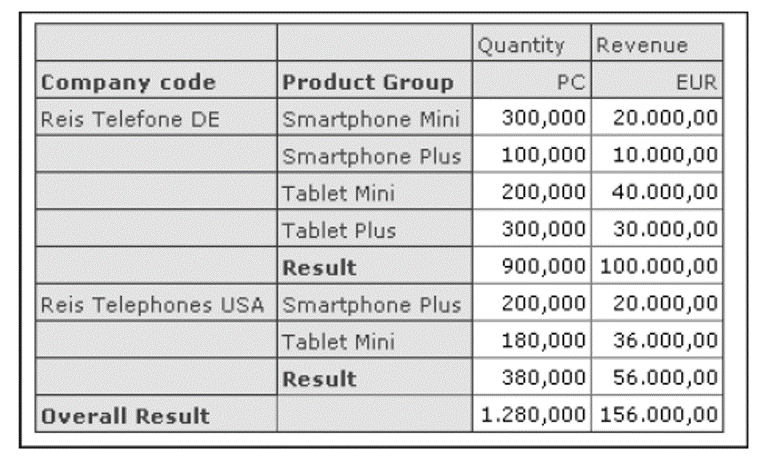
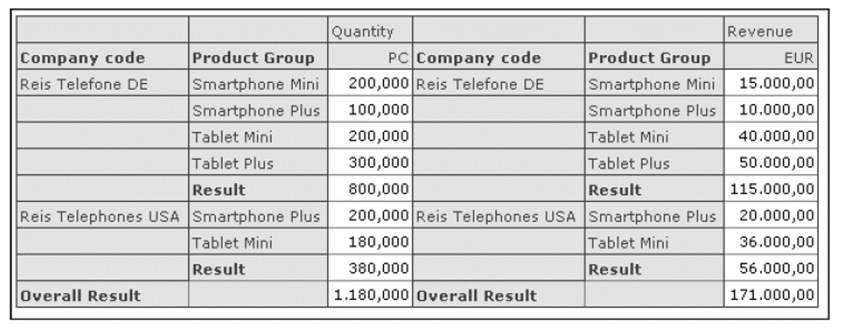
Let’s demonstrate the grouping function using an example. As shown in the figure below, the workbook has two reports: one for the quantity sold and one for the sales of the relevant product groups by company code. While the key figures in the reports are different, the dimensions in the row axes are identical. Therefore, these reports are perfect for combining into one report.
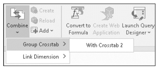
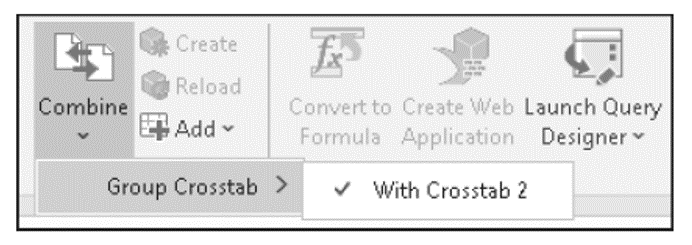
To merge these reports, first select a cell in the report that is to serve as master. Then, in the Build menu group of the Analysis Design tab, go to the Combine dropdown list, click on Group Crosstab, and select the crosstab you want to append, as shown here:
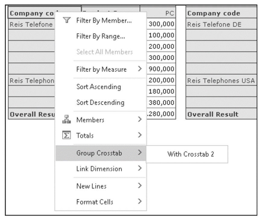
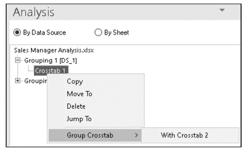
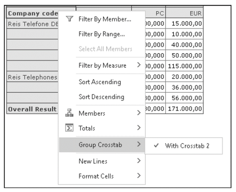
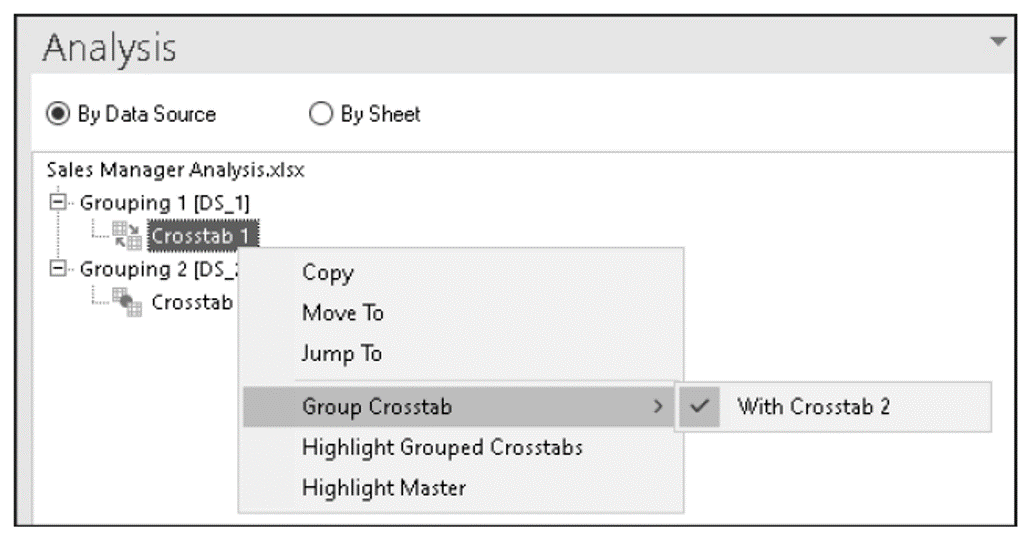
Alternatively, you can also use the context menu. Select the Group Crosstab option and select the crosstable with which you want to group the already selected crosstab, as shown in this figure:
Finally, you can also choose the path via the Design Panel. First, go to the Components tab and select the desired crosstab. Then, select the Group Crosstab option from the context menu, as shown below.
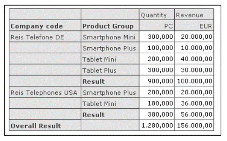
The crosstabs are now merged into a single report, as shown in the next figure, which can be used for data analysis as usual.
All crosstabs have a name, such as SAPCrosstab1, SAPCrosstab2, and so on, which you can use in your Visual Basic for Applications (VBA) macros. The name of the grouped crosstable is then SAPContainer1.
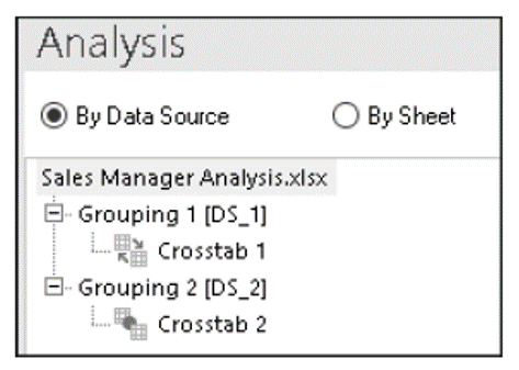
Under the Components tab of the Design Panel, the crosstabs are marked with different icons, as shown in the next figure. The master table is marked with the icon, while the dependent crosstabs are marked with the icon.
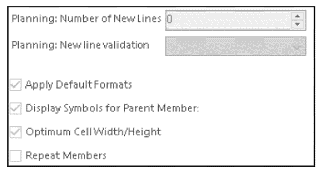
The settings for the grouped crosstab can only be made via the master table and apply to all crosstabs in the merged report. No settings can be changed in the dependent crosstabs. As shown below, all options are grayed out.
If you move the master table to a different position in the worksheet using the Move To option, the entire grouped crosstab is moved. The grouped table thus behaves like a single report, as shown here:
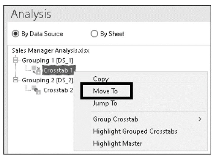
You can also use the Components tab to highlight the individual tables in the worksheet, which facilitates orientation in worksheets with many reports. Simply use the context menu of the relevant cross-classified table. For the master table, select the Highlight Master option, as shown below.
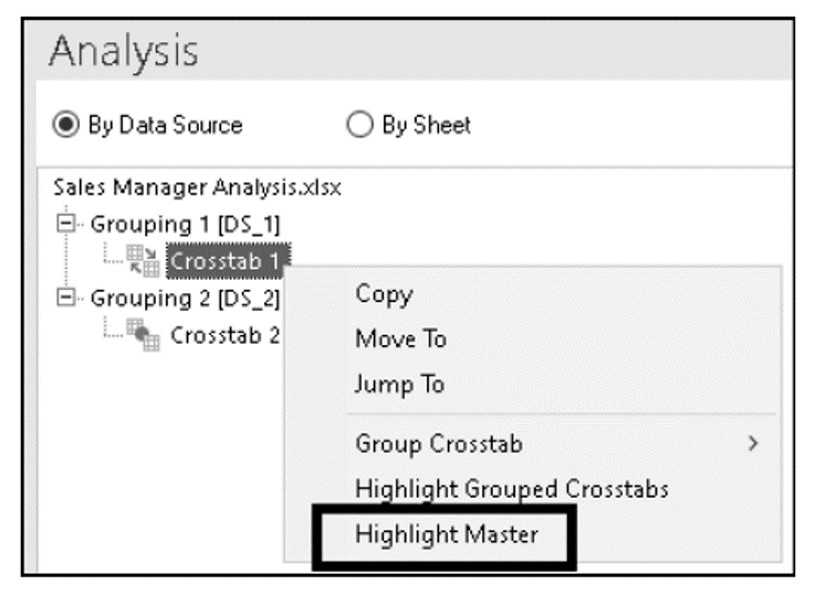
This step highlights the master table in the worksheet. Below shows an example.
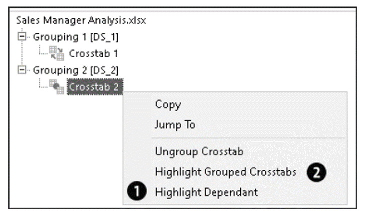
Similarly, you can select the Highlight Dependant option (1) from the context menu to highlight dependent tables, as shown in the next figure. You can also use the Highlight Grouped Crosstabs option (2) to select the entire grouped crosstab.
Ungrouping Reports
To ungroup crosstabs, you can use the menu. Select the master table and choose the Group Crosstab option from the Combine dropdown list, as shown below. Then, remove the checkmark next to the crosstab you want to remove from the grouping.
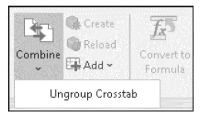
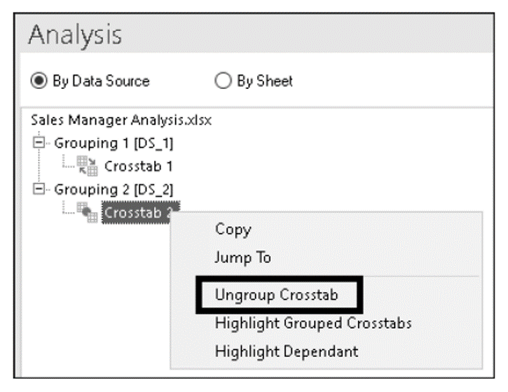
Alternatively, you can select the dependent crosstab and ungroup it using the Ungroup Crosstab option from the Combine dropdown list, as shown here:
You can also select a dimension in the master table itself and choose the path via the context menu. Below shows an example.
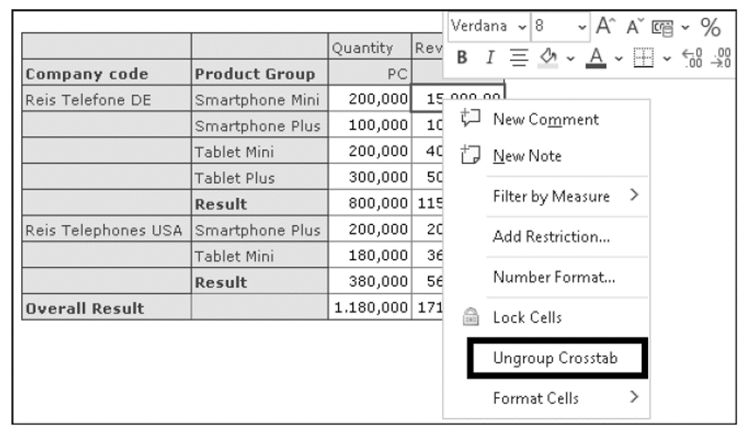
For a dependent crosstab, you can select the Ungroup Crosstab option in the context menu, as shown here:
Of course, you can also use the Components tab in the Design Panel. Select the master table and select the Group Crosstab option from the context menu. Then, deselect the checkbox next to the table that you want to ungroup, as shown in the next figure.
For the dependent crosstab, select the Ungroup Crosstab option from the context menu, as shown here:
After ungrouping, the crosstabs are not brought to their original position, but are displayed side by side. Each crosstab has its own row axis. An example is shown below.
Note, however, that the dimensions of the two crosstabs are still linked. If required, you can unlink them manually.
Learn SAP Analysis for Microsoft Office in Our Upcoming Rheinwerk Course!
Turn your Excel workbook into a powerful SAP reporting and planning hub! In three expert-led course days, you’ll learn essential skills for working with SAP data directly in Microsoft Excel. Click on the banner below to learn more and order your ticket.

11
Editor’s note: This post has been adapted from a section of the book SAP Analysis for Microsoft Office—Practical Guide by Denis Reis.


Comments